Comments (10)
 emilybrick
commented on May 2, 2024
1
emilybrick
commented on May 2, 2024
1
Hey @jhuashao excited you are going to start working on this! We'll catch up about this shortly, but just wanted point to some helpful Figma files:
og image template for social sharing
primer.style team page (rough, a bit out of date)
primer.style what's new page (rough, a bit out of date)
from design.
emilybrick
commented on May 2, 2024
1
The general layout is feeling nice! I dig the movement in the illo. Couple thoughts:
-
I think the three boxes could use a bit more breathing room between them, even if it means making them a bit smaller.
-
Dot grid: I would opt for the dot grid instead of the diamond grid you have in the bottom right, so it's consistent with the other illustrations


-
Stroke width: I'm not sure how valid this is, but my gut feeling is that we should stick with the same stroke with across the board unless you're layering shapes (like those two squiggles maybe)). I would at least stick with thicker stroke width for that long path (the path that moves across the entire composition).
-
Paring it down a bit: I like the rectangle gradient, but I think you could get away with just one (instead of two). I wonder if we can incorporate more of the block-y bars in place of the gradient bar (once it's removed). One thing about the block-y bars I've noticed is that they usually appear stacked on top of one another, to signify "code lines" etc
-
Circles: The standalone circles feel out of place to me, without other shapes to compliment them. It might be cool to try pairing a circle with a smaller circle or different shape, similarly to:


-
On that note, I'm curious how the GitHub logo would work without the arcs/lines? As a standalone it looks nice, but in the overall composition I'm not sure if it fits as much – still really reminiscent of Atom to me.
-
I like the gridlines idea, however what's standing out to me right now is how sharp the contrast between the two boxes on the left are to the one on the right. I would suggest either using a darker blue fill color, or stick with an outline box for all three. It might (e.g. not sure if this is worth exploring) be interesting to layer the gridlines rectangle on top of the outline box. That said, I think that might only work if the fill-color is a darker blue, the light blue is a bit overpowering imo.
Thanks for continuing to work through this! I'm curious how @broccolini feels, since I'm new to this style as well.
from design.
emilybrick
commented on May 2, 2024
1
One other super small note, I think it might be cool to think about the "box" as a solid layer. Meaning, some shapes can behind the layer, similarly to:

while other shapes can live on top of the layer:

I wonder if we can achieve the same type of effect in this first box, rather than shapes overlapping behind the box:

from design.
 jhuashao
commented on May 2, 2024
1
jhuashao
commented on May 2, 2024
1
Finalization and Bodymovin Integration
After finalizing the illustration itself, I had a bit of poking around an After Effect library called Bodymovin, and decided to try a bit of animation to make it a little more lively.
Bodymovin, is a library that takes Aftereffects animations and converts them into JSON, which is then rendered as an SVG animation. Rather than use CSS and JS to wrangle animations in the web, this extension packages all that away into a tidy file. Airbnb loved the library, and extended its capabilities into iOS, Android, and React Native by creating Lottie
I went through some iterations of animating the file, but @emilybrick and @broccolini and I settled on the following:
For React, Bodymovin requires a wrapper, which I downloaded using this command:
npm install --save react-bodymovin
Full documentation here: https://www.npmjs.com/package/react-bodymovin
To test the animation out, I created a branch on primer.style and threw it into the homepage to see if it would work:

Renders well! And it’s fully responsive!🎉
I was really happy with the results and hope this workflow is something that others might find helpful too!
from design.
jhuashao
commented on May 2, 2024
1
@emilybrick gonna check in w/ @shawnbot about implementation! I'll follow up with something more concrete soon
from design.
jhuashao
commented on May 2, 2024
Design Guidelines: Banner Illustration Process
Research (w/ @emilybrick)
Design Guidelines Inspiration

Keywords + Drafting:
—Components are flexible, and allow for designer and developer velocity
—Fluidity is key, and this is an important aspect of design guidelines
—Foundations are critical, and provide guardrails for designers and developers

Banner Iterations
Choice 1 — simplified, three elements, incorporating consistent elements, lends itself well to animation

Choice 2 — more emphasis in foundations, rectangular vocabulary, slight shift in illustration style
Choice 3 — more complex exploration with more elements, experimental pseudo data-visualization

Moving Forwards
—investing more time and effort into Choice 1
—Notes from Critique:
- square edges on boxes
- introducing "planets: + space theme would need consistency with Atom
—Primary Next Steps
- Refine drawing and finalize static version
- Work with @shawnbot to implement on website, make sure sizing + layout works!
—Secondary Next Steps
- Animating the illustration itself (Aftereffects)
- Bodymovin' Integration!
from design.
jhuashao
commented on May 2, 2024
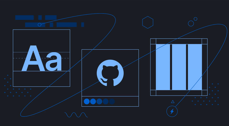
Current iteration of Banner Design Illustration:
- Added Atom illustration elements
- Move towards space theme
- Altered foundation elements to stroke borders
- Redesigned "Layout" component
- Converted dot motif to stars


from design.
jhuashao
commented on May 2, 2024
After @broccolini and @emilybrick's feedback, I opted for a simplified palette, as well as removing unnecessary clutter.
-Moved illustration to Figma
-Solid Layers for foundation squares
-Codelines following proper spacing
-Removed inconsistent wiggle lines
-Removed Atom lines
-Color corrected/ simplified palette on foundation boxes
-Reverted stars back to dots
I believe we're getting close to the final version!

from design.
emilybrick
commented on May 2, 2024
nice @jhuashao ! Do you want to post the primer.style pr in here?
from design.
jhuashao
commented on May 2, 2024
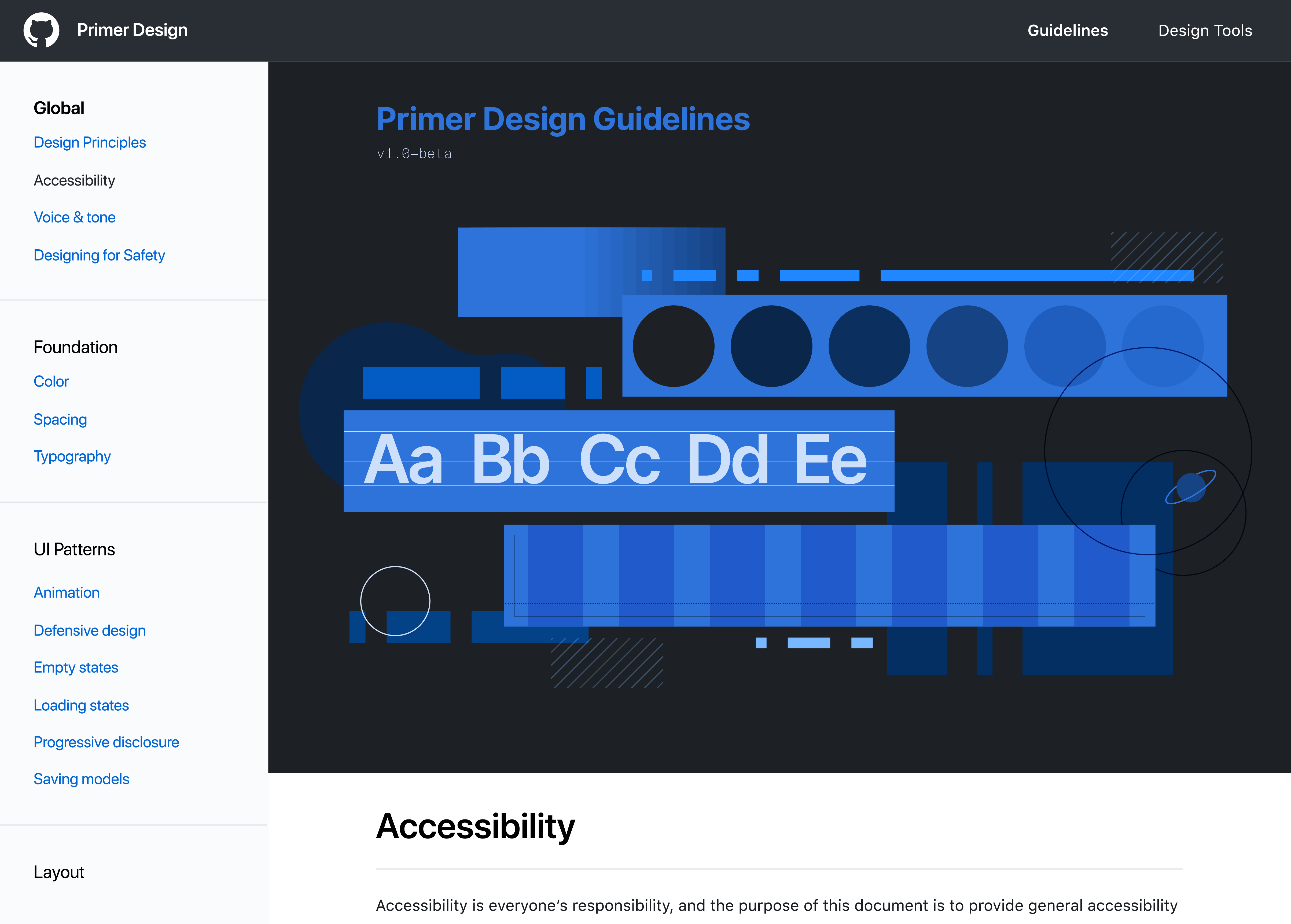
@shawnbot did some fancy footwork and yasss it finally works!!!
https://primer-design-banner.now.sh/design
from design.
Related Issues (20)
- Support "inert" ActionList items HOT 1
- Add a variant to Blankstate that makes it easier to use in small areas HOT 1
- Add "unavailable" variant to StatusLabel/State HOT 1
- Support button loading state HOT 1
- Support loading state on NavList items HOT 1
- General-use "content skeleton" loading indicator component(s) HOT 1
- Allow ProgressBar to be animated HOT 1
- Settings page layout component HOT 2
- Form container component HOT 1
- A component to support viewing and editing configurations HOT 1
- A component to view configurations in a compact key-value style HOT 1
- 'nvm run --default'
- `An Alphabet of Accessibility Issues` is no longer reachable
- Provide way to document complex props, types, or add examples for React components HOT 4
- settings
- Hanselygratel6
- Replace Esc key listeners with a CloseWatcher in supported browsers
- Why is there no style for markdown alert?
- 哈哈哈哈
- Sidebar dropdown - Foundations > Color > Primitives is displaying incorrectly
Recommend Projects
-
 React
React
A declarative, efficient, and flexible JavaScript library for building user interfaces.
-
Vue.js
🖖 Vue.js is a progressive, incrementally-adoptable JavaScript framework for building UI on the web.
-
 Typescript
TypeScript is a superset of JavaScript that compiles to clean JavaScript output.
-
TensorFlow
An Open Source Machine Learning Framework for Everyone
-
Django
The Web framework for perfectionists with deadlines.
-
 Laravel
A PHP framework for web artisans
-
D3
Bring data to life with SVG, Canvas and HTML. 📊📈🎉
-
Recommend Topics
-
javascript
JavaScript (JS) is a lightweight interpreted programming language with first-class functions.
-
web
Some thing interesting about web. New door for the world.
-
server
A server is a program made to process requests and deliver data to clients.
-
Machine learning
Machine learning is a way of modeling and interpreting data that allows a piece of software to respond intelligently.
-
Visualization
Some thing interesting about visualization, use data art
-
Game
Some thing interesting about game, make everyone happy.
Recommend Org
-
Facebook
We are working to build community through open source technology. NB: members must have two-factor auth.
-
Microsoft
Open source projects and samples from Microsoft.
-
Google
Google ❤️ Open Source for everyone.
-
Alibaba
Alibaba Open Source for everyone
-
D3
Data-Driven Documents codes.
-
Tencent
China tencent open source team.
from design.