Comments (4)
 lucduron
commented on May 30, 2024
lucduron
commented on May 30, 2024
There is no integrated tool to export a figure of a scalar.
However you can visualize a scalar in Mono tab (workflow interface), see https://github.com/CNR-Engineering/PyTelTools/wiki/Visualization#visualize-scalars. You can write this tool from scratch after parsing the Selafin file (https://github.com/CNR-Engineering/PyTelTools/blob/master/notebook/Handle%20Serafin%20files.ipynb), you will need mesh characteristics (mesh coordinates and connectivity table).
from pyteltools.
 krober10nd
commented on May 30, 2024
krober10nd
commented on May 30, 2024
Thanks for the response. I could read the file fine using the notebook command but how do I arrive at this plot? It's fairly unclear in my opinion. It would be beneficial to have the code to make the plot next to the plot, don't you think?
https://github.com/CNR-Engineering/PyTelTools/wiki/Visualization#visualize-scalars
from pyteltools.
lucduron
commented on May 30, 2024
The plots in PyTelTools are basically performed with matplotlib (tricontourf).
Here is a snippet to do it (you have to adapt values to your case) :
import matplotlib.pyplot as plt
from matplotlib import cm
import matplotlib.tri as mtri
from mpl_toolkits.axes_grid1 import make_axes_locatable
import numpy as np

from pyteltools.slf import Serafin


with Serafin.Read('../PyTelTools_validation/data/Yen/fis_yen-exp.slf', 'en') as resin:
    # Read header (SerafinHeader is stored in `header` attribute of `Serafin` class)
    resin.read_header()

    # Display a summary
    print(resin.header.summary())

    # Get time (in seconds) and display it
    resin.get_time()
    print(resin.time)

    values = resin.read_var_in_frame(10, 'B')

    fig, axes = plt.subplots(1)
    fig.set_size_inches(10.0, 6.0)
    levels = np.linspace(np.nanmin(values), np.nanmax(values), 100)

    triang = mtri.Triangulation(resin.header.x, resin.header.y, resin.header.ikle_2d -1)
    axes.tricontourf(triang, values, cmap='terrain', levels=levels)
    axes.set_aspect('equal')

    divider = make_axes_locatable(axes)
    cax = divider.append_axes('right', size='5%', pad=0.2)
    cmap = cm.ScalarMappable(cmap='terrain')
    cmap.set_array(levels)
    fig.colorbar(cmap, cax=cax)

    plt.show()
The preview of the result is displayed below:
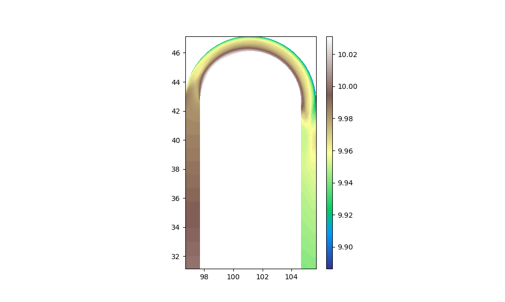
Hope it helps.
from pyteltools.
krober10nd
commented on May 30, 2024
Excellent now I understand and can plot some of my solutions. Thank you.
from pyteltools.
Related Issues (20)
- `SerafinHeader.from_triangulation` performance HOT 3
- Support for 3D boundary files HOT 4
- Depth-averaging for 3D Serafin files HOT 2
- Add two variables HOT 2
- Fix temporal mean operator
- Interpolate to 2D vertical cross section HOT 2
- Provide example to reproject result HOT 1
- Error in Vertical Cross Section HOT 6
- Creating workflow and running from terminal HOT 1
- Error in SynchMax HOT 9
- Question regarding volume calculation HOT 2
- Liquid Flux Calculation Orientation HOT 1
- Duration over threshold
- Language selection in comp_ADCP_t2d HOT 1
- Enable Visualize Scalars and Visualize Vectors on Serafin 3D
- Add method to build IPOBO from scratch
- VTK export
- bug in Mesh2D __init__ HOT 4
- Propose to add get_time_fast() to the Sefafin.py HOT 1
Recommend Projects
-
 React
React
A declarative, efficient, and flexible JavaScript library for building user interfaces.
-
Vue.js
🖖 Vue.js is a progressive, incrementally-adoptable JavaScript framework for building UI on the web.
-
 Typescript
TypeScript is a superset of JavaScript that compiles to clean JavaScript output.
-
TensorFlow
An Open Source Machine Learning Framework for Everyone
-
Django
The Web framework for perfectionists with deadlines.
-
 Laravel
A PHP framework for web artisans
-
D3
Bring data to life with SVG, Canvas and HTML. 📊📈🎉
-
Recommend Topics
-
javascript
JavaScript (JS) is a lightweight interpreted programming language with first-class functions.
-
web
Some thing interesting about web. New door for the world.
-
server
A server is a program made to process requests and deliver data to clients.
-
Machine learning
Machine learning is a way of modeling and interpreting data that allows a piece of software to respond intelligently.
-
Visualization
Some thing interesting about visualization, use data art
-
Game
Some thing interesting about game, make everyone happy.
Recommend Org
-
Facebook
We are working to build community through open source technology. NB: members must have two-factor auth.
-
Microsoft
Open source projects and samples from Microsoft.
-
Google
Google ❤️ Open Source for everyone.
-
Alibaba
Alibaba Open Source for everyone
-
D3
Data-Driven Documents codes.
-
Tencent
China tencent open source team.
from pyteltools.